
+86 18305395512 ( 0 )
 EN
EN
Colour-Coded Filing Guide: Building a Folder System That Works
Why colour coding works in filing
Colour-coded filing turns a shelf of look-alike folders into a system the eye can read at a glance. Instead of pulling a spine out to check a subject, a user picks the colour first: one client, one department or one year sits in a known colour, so the file is found by colour before it is found by label. For a B2B buyer the point is that a colour-coded filing system is sold as a set, not as one folder - the value is in a matched run of colours that a workplace adopts as a standard and reorders year after year.
This guide covers the colour set, the folder types the system runs across, the print and label side, and the markets where colour-coded filing sells best.
The standard colour set and what each colour signals
Most colour-coded filing systems are built on five to eight base colours: red, blue, green, yellow, orange, purple, black and white. The colours are not decorative - they carry meaning, and a workplace assigns that meaning when it rolls the system out. Common patterns include one colour per department, one colour per client, one colour per year, or a red-for-urgent, green-for-current, blue-for-archive split.
Two practical rules decide whether the set works. First, adjacent colours must be easy to tell apart at a glance, so a set built from red, orange and pink fails in a dim filing room while red, blue and green reads instantly. Second, the set must be stable: if a buyer reorders the same colour run each year, the colour code has to sit on the same board and film so the new folders match the old ones on the shelf. A supplier who can hold a colour reference across repeat orders is worth more than one who prints a fresh shade each time.
Solid-colour folders give the strongest signal because the colour covers the whole face. Transparent folders can still join a colour system, but the colour is usually carried on a spine strip, a tab or a printed panel rather than the body of the folder.
Colour coding across folder types
Colour coding is not tied to one folder. It runs across the range a buyer already stocks, and the same colour set is expected to hold from one type to the next.
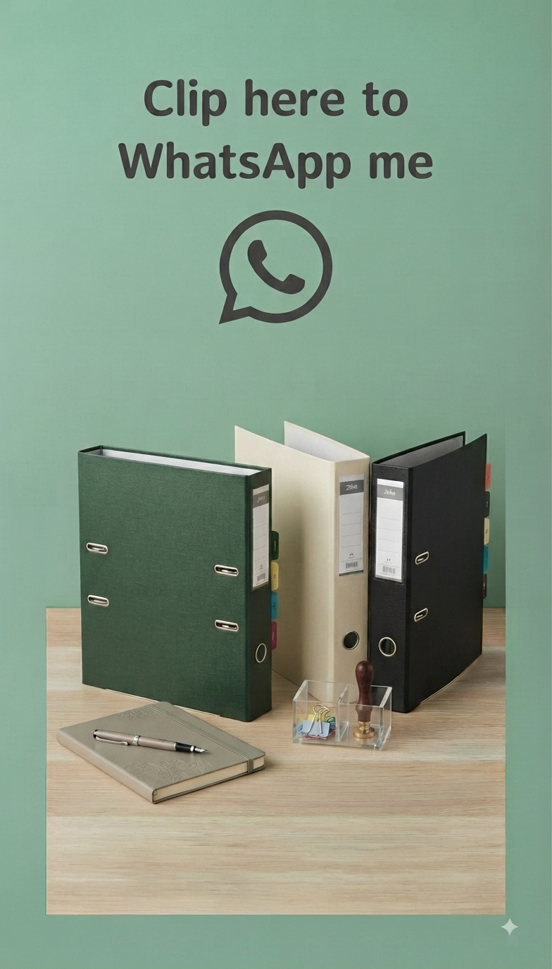
A document wallet in a solid colour is the simplest carrier of the system, because the opaque face holds a strong flat colour and the wallet sits in a drawer or a bag without needing a tab. A lever arch file takes colour on the spine and the cover, so a shelf of files reads as a colour block from the front. An expanding file or a box file carries colour on the outer board, which lets a whole archive read by colour when the files are stacked sideways. Ring binders, presentation binders and display books round out the set, so a workplace can keep one colour code across every format it uses.
The tab is where colour coding meets filing speed. A coloured tab on a coloured folder lets a user see both the category and the position in one glance, and a tab cut to a fixed position keeps the run aligned when the folders stand together.
Print, labels and holding a colour match
Print and colour coding work together when the design keeps them apart. A good folder carries the colour as the base and the brand mark, the label panel or the index text in a defined area, so the colour signal is never buried under a busy print. A label that sits inside a printed frame looks deliberate; the same label dropped on top of a full-bleed design looks like an afterthought.
The colour match is the part buyers underestimate. A colour agreed for one order has to come back the same on the reorder, or the shelf turns patchy and the system loses its meaning. The way to hold a match is to fix the board or film, the ink reference and the finish - matt, gloss or textured - and to keep all three on file. A supplier who tracks that reference can repeat the run; one who does not will drift.
Where colour-coded filing sells
Colour-coded filing sells anywhere files are shared and a stock is reordered. Offices use it to sort by department or by project. Schools and universities sort by class, subject or year, and the colour set has to survive heavy handling by students. Clinics use colour to mark patient groups or record types, where a wrong file is a real cost. Warehouses and workshops use it for job sheets, maintenance logs and shift handovers.
The pattern is the same in each case: the buyer is not shopping for a single folder, but for a system that a whole site can adopt and keep. That is why a supplier who offers a stable colour run across several folder types wins the repeat order over one who only sells a folder.
How ZOKABS produces colour-coded folders
ZOKABS runs colour-coded folders across its PVC folder range, from document wallets and box files to lever arch files, ring binders and display books. The factory works from a colour reference on file, so a repeat order lines up with the previous one, and it holds the finish - matt, gloss or textured - on the same reference.
Print sits in a defined area so the colour signal stays clear, and the tab position and the spine width are set once and carried across the run. A buyer can specify the colour set, the folder types and the number of colours, and the factory will build a matched run rather than a bundle of unrelated folders.
FAQ
How many colours should a colour-coded filing system have?
Most systems use five to eight base colours. The right number is the smallest set that separates the categories a site actually files by, and it should stay the same on the reorder so the code keeps its meaning.
Do transparent folders work in a colour-coded system?
Yes, but the colour is carried differently. A transparent folder takes colour on a spine strip, a tab or a printed panel, while a solid-colour folder carries the colour across the whole face and gives the stronger signal.
How do I keep the colour the same across repeat orders?
Fix the board or film, the ink reference and the finish on file, and reorder against that reference. A supplier who tracks the reference can repeat the run; a colour agreed only by eye will drift.
Can colour coding run across different folder types?
Yes, and that is where it earns its place. The same colour set can run across wallets, box files, lever arch files and ring binders, so a workplace keeps one code across every format it uses.
Tell ZOKABS the colour set, the folder types and the order volume, and the factory will line up the colour reference, the finish and a matching carton plan for the next order.
Subscribe for our latest Updates
Stay up to date with the latest news, announcement and articles.- Contact Us
- Daguanzhuang,Tancheng,Linyi,Shandong,China, 276111
- +86 18305395512
- Aria@zokabs.com
- Products
- Promotion File
- Clipboard
- Ring binder
- Lever arch file & Box file
- Expandable Storage Files
- Sheet Protector & L folder
- Poly & Paper Folders
- About us
- About us
- Company Technology